 Complete E-2 Process Support
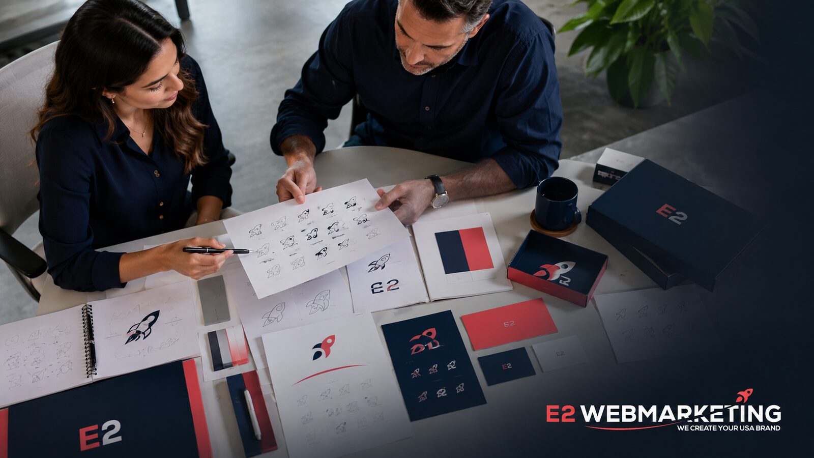
Begin with positioning
Color and typography cannot solve an unclear offer. Before design starts, define the audience, category, promise, personality, and the practical reasons a customer should choose the company.
This foundation gives the designer criteria for decisions and prevents the process from becoming a contest of personal taste.
Build a usable identity
The logo needs to work at the size of a browser icon and on a vehicle, proposal, shirt, or storefront. A simple mark with strong proportions usually adapts better than a detailed illustration.
Typography, color, image style, spacing, and voice do much of the everyday work. Document them in a concise guide with examples the team will actually use.
Create consistency without rigidity
A brand should feel related across the website, social media, sales material, and customer experience. Templates can protect that consistency while leaving enough room for different messages.
Review the system against real applications before approving isolated presentation mockups.
A logo is a tool, not the whole brand
A strong logo helps people recognize a company, but recognition grows through repeated experiences. The name, promise, visual style, service, follow-up, and customer results all shape the brand. This is good news for a young business: it does not need a symbol that explains everything. It needs a clear, distinctive mark that works reliably while the company earns meaning around it.
Begin with strategy before sketches. Define the audience, the desired impression, the competitive environment, and the places where the logo will appear. A premium business-to-business firm may need a different tone from a playful family service. Looking at competitors is useful for avoiding sameness, but copying the visual language of the largest player will make the new brand harder to remember.
The design should work in one color, at small sizes, and on light and dark backgrounds. Test it as a website header, social avatar, invoice, sign, shirt, and mobile icon. Fine details that look impressive on a large presentation may disappear in normal use. A flexible logo system usually includes a primary lockup, a compact mark, and clear spacing rules.
Turn the design into a usable identity
Color and typography should support the same personality without becoming a costume. Select a restrained palette with accessible contrast and fonts that remain readable across web and print. Define practical rules for headings, body text, buttons, backgrounds, photography, and icons. These decisions help future materials feel related even when different people create them.
Ask for the right final files: vector SVG or EPS, print-ready PDF, transparent PNG where needed, color specifications, font information, and versions for common backgrounds. The business should understand usage rights and own the approved assets. A folder full of unlabeled files is not a brand system; a short guide makes the identity much easier to use correctly.
After launch, resist the urge to redesign whenever a campaign underperforms. First check the offer, audience, proof, and customer experience. Brands become familiar through consistent use. Adjustments are normal as a company matures, but they should solve a real problem. The best identity is not the one that attracts the most internal opinions—it is the one customers recognize and trust.
A practical next step
- Write the positioning before reviewing visual concepts.
- Test the logo in small, large, light, and dark applications.
- Create practical templates for the team’s recurring needs.
E2 Webmarketing provides business, market-entry, and marketing support. We do not provide legal, visa, or immigration information or advice.